
Business
From Onboarding to Upskilling: Building Corporate Training That Works


Many corporate training programs are ineffective even before anyone looks at the content. The program might be incredible. But if the room won’t let people get in a circle for a discussion, if the remote half of the team can’t hear the breakout discussion, or if nobody checks in two weeks later to compare notes and best practices, the content’s all for naught.
The environment is infrastructure, not a venue
Most of the time, L&D teams are planning what content they need – which modules, which vendor, which certification path. And we treat the environment as a booking problem – find a room, send a calendar invite, order coffee. But that’s backwards.
The room, the seating, the AV setup, the scheduling cadence, and the reinforcement plan are all load-bearing. A weak version of any one of them caps what the curriculum can deliver, no matter how good the material.
You can build the best onboarding curriculum in the industry and still watch new hires disengage by day three if they’re sitting in fixed lecture seating for six hours with no breaks and no chance to practice what they just heard. Infrastructure sets the ceiling. Content just fills it.
Onboarding and upskilling need different builds
The distinction between onboarding and upskilling is made very clear in the title of this piece. They are different challenges and require different approaches.
Onboarding is high-touch and cohort-based. New hires are anxious, they don’t know the systems yet, and a lot of what they’re absorbing is cultural and relational, not just procedural. It benefits from in-person time, consistent small groups, and a room built for connection – round tables, not rows.
When everything is new and little mistakes feel big, you need people around you who know where you’re coming from and who make you feel safe.
Upskilling looks nothing like that. It’s shorter, more frequent, and usually self-directed. A mid-career employee learning a new tool doesn’t need a three-day cohort experience. They need a short module, a job aid, and maybe an hour of live practice with a facilitator.
Building one generic training space and one generic format for both of these guarantees a compromise. Onboarding ends up feeling rushed and impersonal, and upskilling ends up bloated with ceremony nobody has time for.
Start with a skills taxonomy before you buy anything
Before you reserve a classroom (virtual or otherwise), define what good would look like. Figure out whose results are too low, too slow, or too conflicted. Identify what they’re doing, thinking, or feeling that’s suboptimal.
Then build from there. A skills taxonomy – even a rough one – forces a harder but more useful question: what does a competent person in this role actually do differently from an incompetent one, and what’s the fastest way to close that gap?
Classroom time should be reserved for social learning – analysis, judgment, and design. Discussions, reflections, and simulations around the chosen moments of need. People swimming in the same pool of content, not drowning in the torrent.
The room is where they build tools, and you should build exercises that clearly distinguish use of the tool and skill with the tool. Answering those questions first changes everything downstream – the modality, the group size, the room, the schedule.
Choosing the modality mix deliberately
Once you have determined what it is you’re hoping to teach, the next instructional decision to make is where that learning fits best. The 70-20-10 framework, developed by the Center for Creative Leadership, comes in handy at this step.
Roughly 70% of our learning occurs through job-related experiences and “practice,” 20% through interactions with others or the “social” aspects of work, and 10% through classes and workshops or “formal” training. Use those proportions as a guidepost for thinking about how “natural” you want this learning to feel.
None of these are hard-and-fast rules (the 70-20-10 framework has been widely misinterpreted and extrapolated beyond what it meant to capture). The point is, while you might be designing a training room, there’s less need to design training that happens in a room.
You want to make work-like, human interactions and “learning” the default. That perspective will influence a lot of your design decisions about how to lay out the environment, how to structure individual sessions and daily cadence, and how to put technology to use.
Room configuration is a training decision
Furniture is not a logistics detail. It’s a design choice that determines what kind of learning can happen in the space.
For instance, fixed lecture seating limits facilitators to one-way communication. You won’t be able to organize role-play, fishbowl exercises, or have a small-group debrief with forty bolted chairs in rows facing the podium.
On the other hand, movable tables and chairs can be used for breakout activities, allowing facilitators to reconfigure the arrangement during the session. It also indicates to the participants that this is a working session and not a presentation where they are supposed to sit and listen quietly.
Acoustics play a more important role than many L&D leads consider. Put four breakout groups in an open room with solid walls and no sound treatment, and you are left with competing noise that undermines the purpose of small-group exercises. People will begin to speak louder to be heard, distracting other groups, and the small-group exercise aimed at fostering confidence in a low-pressure environment adds friction instead.
In this scenario, ergonomics becomes a necessity rather than a pleasant attribute. Adults lose interest in activities that last several hours while seated uncomfortably. It’s not a comfort issue, it’s about getting involved – uncomfortable people stop paying attention.
The same applies to accessibility: a clear view of the screen, space for special equipment, availability of materials in various forms, all add up to provide a more inclusive environment. None of these should be optional if the focus is to engage everyone rather than merely give that impression.
Getting this right is largely a matter of building effective workspaces rather than defaulting to whatever furniture happened to be in the room already.
Psychological safety runs through all of this too. Role-play and open feedback only happen when people feel safe being wrong in front of colleagues, and a room that’s cramped, loud, or arranged like a courtroom works against that every time.
Hybrid delivery needs parity, not an afterthought
Distributed teams mean hybrid delivery is the default, not the exception, and most rooms still aren’t built for it. A single camera at the front of the room, pointed at the facilitator, and remote participants are an audience watching a webinar.
They can’t hear side conversations during breakouts, they can’t see what’s written on a whiteboard unless someone thinks to angle a laptop towards it, and they get none of the informal moments where a lot of the actual learning happens.
It doesn’t require a huge budget to fix this. Just deliberate placement: cameras and mics positioned to catch small-group discussion, not just the front of the room; displays that remote learners can actually read; a habit of narrating what’s on a physical whiteboard instead of assuming everyone can see it.
VILT sessions need the same discipline – breakout rooms, polls, and chat prompts that mirror the in-person exercises, so remote learners are doing the work, not just watching it happen.
Facilitators are part of the infrastructure
Bringing in a subject-matter expert to run a session because they know the content is not synonymous with bringing in a good facilitator. Adult learners – per Malcolm Knowles’ work on andragogy – need to know the relevance, the autonomy, and the reason to care about what they’re being taught. Left to their own devices, most SMEs default to lecturing, because that’s what they’ve seen modeled and that’s the path of least resistance.
Training the trainer is as important as training the room. They need coaching on pacing, on how to run a debrief that actually surfaces insight instead of silence, and on how to read a room that’s gone quiet because people are lost, not because they’re taking everything in.
This is cheap to fix relative to everything else on this list, and it’s routinely the piece that gets skipped, because everyone assumes expertise in the subject transfers automatically into expertise in teaching it.
Build in reinforcement, then measure what matters
The failure point in corporate L&D is learning transfer: did training actually change on-the-job behavior? It’s almost entirely a design problem, not a content problem. A single session, no matter how well it ran, fades fast from memory if it’s not used. Manager check-ins, spaced practice, job aids, and short follow-up sessions two or three weeks out are what turns an event memory into a habit.
Build those into the plan from day one, not as an afterthought once the main session ends. Microlearning fits well here: a five-minute refresher a week after the main session will do more for retention than a second long workshop would’ve.
For measurement, the Kirkpatrick model gives a useful ladder. Level one and two, reaction and learning, are easy to capture and great for immediate feedback, but they don’t tell you if anything changed.
At least one level-three measure (observed behavior change) or level-four measure (business results, like reduced errors or faster ramp time) needs to be part of the plan if the infrastructure spend is going to survive the next budget cycle. Cost per learner is easy to calculate and easy to challenge. A behavior-change metric is what actually defends the number.
Building the environment on purpose
None of these suggestions imply that a typical training budget needs to be expanded. It’s all about making the learning environment and content delivery just as intentional as the curriculum itself. Get the taxonomy right, set the modality mix, design a practice room, ensure remote learner parity, coach the facilitators, and implement a strong finish. Then see how your training investments pay off.


Digital asset businesses face growing pressure to prove that every transaction is recorded, reconciled and reported accurately. As operations expand across networks, wallets and legal jurisdictions, spreadsheets and disconnected systems become harder to control. Compliance therefore needs to develop alongside the business.
A clear operating model, supported by reliable data and automated checks, can reduce reporting delays while giving directors, auditors and commercial partners greater confidence in the organisation’s financial records.
The Evolving Regulatory Landscape
Rules for digital assets continue to develop at different speeds across major markets. Regulators are examining asset classification, custody arrangements, transaction reporting and the controls businesses use to protect financial data. Recent digital asset enforcement activity also shows how quickly supervisory expectations can affect operating practices.
You should maintain a register of applicable requirements, responsible owners and review dates. For example, a company entering a new jurisdiction should assess local reporting obligations before processing customer transactions there. Broader analysis of digital asset regulation can also help leadership teams identify policy trends that may influence future expansion plans.
Risks of Non-Compliance
Poor compliance creates costs that extend beyond a regulatory penalty. Incomplete transaction histories may delay an audit, while inconsistent asset valuations can produce unreliable management accounts. A missing link between a wallet transfer and its supporting business record may require hours of manual investigation.
These problems often emerge during rapid growth. A finance team might reconcile 500 monthly transactions without difficulty, then struggle when activity rises to 20,000 transactions across several networks. Set clear standards for transaction ownership, valuation methods, approval evidence and record retention before volumes increase. Regular control testing can then identify missing data or unexplained balances early enough for staff to correct them.
Automating Compliance for Efficiency
Automation helps finance teams apply consistent controls across large transaction volumes. Crypto accounting software can help digital asset businesses automate accounting, streamline reconciliation, prepare audit reports and manage financial data across more than 220 supported networks.
Start with repetitive processes that consume significant staff time. These may include importing wallet activity, matching transfers between company-controlled addresses and flagging transactions with missing classifications.
Human review remains necessary for exceptions, unusual valuations and policy decisions, but automated workflows can direct staff towards the records that genuinely need attention. Keep an audit trail showing when data entered the system, what checks took place and who approved each correction.
Building Trust in the Digital Economy
Reliable compliance records give external parties evidence that a business controls its financial operations. Investors can assess reported performance more confidently, auditors can trace balances to source transactions, and banking partners can review how funds move through the organisation. This evidence can shorten due diligence when the company seeks funding or enters a commercial partnership.
Trust also depends on internal consistency. Finance, legal and operations teams should use the same definitions for transaction types, ownership and reporting status. Schedule periodic reviews in which these teams examine a sample of records from initiation through to final reporting. Any disagreement should lead to a documented policy update, staff guidance and a follow-up test.
Strategic Advantage of Proactive Compliance
A proactive programme prepares the business for regulatory change without forcing teams into repeated emergency projects. It also supports expansion because leaders can see which markets, products and transaction types require extra controls before approving investment.
Treat compliance technology as part of wider operational planning. Guidance on digital readiness and future-proofing explains why systems, processes and staff capabilities need to develop together. Assign ownership of each control, measure unresolved exceptions and track the time required to close reporting periods. Those figures reveal where poor data or manual work is slowing growth.
The strongest next step is to test one complete reporting cycle. Trace transactions from their original network records through reconciliation, approval and financial reporting, then document every gap. That exercise produces a practical improvement plan grounded in the way your digital asset operation actually works.

Employee well-being has become a practical workforce strategy, affecting attendance, retention, and day-to-day performance. People do their best work when they have enough energy, feel supported, and can access help before a manageable concern becomes a serious problem.
For employers, that means looking beyond occasional wellness events and building support into everyday operations. A thoughtful approach can strengthen productivity today while helping the organization adapt to an aging workforce, changing employee expectations and new ways of working.
Why Employee Well-being Matters
Well-being influences how employees focus, communicate, and respond to pressure. Gallup’s work on employee well-being connects it with engagement, performance and other business outcomes. A person dealing with poor sleep, ongoing stress or an untreated health concern may need more time to complete routine tasks and may be more likely to miss work.
Managers should watch for patterns across teams without trying to diagnose individuals. Rising absences, frequent mistakes, and missed deadlines can signal problems with workload or support. Regular check-ins give employees a safe place to raise concerns before those concerns affect an entire project.
Beyond Basic Benefits
Health coverage and paid time off provide a foundation, but employees also need services they can use easily. A strong program may include flexible scheduling, mental health support, ergonomic reviews, and access to preventive screenings. Current thinking on workplace well-being strategy also emphasizes coordinated support over isolated perks.
Offer options that reflect actual workforce needs. Employees who work in noisy environments, notice changes in their hearing, or have concerns about their hearing health may benefit from a free hearing test to assess whether further evaluation is needed. Clear communication about confidentiality can help employees feel more comfortable exploring available services.
Preventative Health for Productivity
Preventive care can address small concerns before they cause avoidable disruption. Screenings, vaccinations, and routine checkups may help employees identify conditions that affect concentration, stamina, or communication. Employers can support these habits without collecting personal medical details.
Make services practical to use. Give employees protected time for appointments, explain available benefits in plain language, and send reminders at appropriate intervals. A warehouse might schedule annual hearing and vision screening information before its busiest season, while an office could offer workstation assessments after a move. Remote employees may need guidance on home-office ergonomics and meeting fatigue. Each option should be voluntary, accessible, and relevant to the work people perform.
Creating a Culture of Care
Policies carry more weight when managers follow them consistently. Employees are unlikely to take restorative time off if leaders send messages late at night or praise people for working while sick. Train supervisors to discuss workload, recognize signs of strain, and direct employees toward qualified resources.
Social connection deserves attention too, especially in hybrid and remote teams. Peer mentoring, small group lunches and volunteer days can build relationships without forcing personal disclosure. The connection between social life and well-being is especially relevant as employees move through different life stages. Give people several ways to participate so quieter team members and distributed staff aren’t excluded.
Measuring Impact and ROI
Set a baseline before expanding your well-being program. Track voluntary participation, absenteeism, turnover, and employee survey results while protecting individual privacy. Operational measures can add context, such as error rates, missed deadlines, or customer complaints. Review the figures by department only when groups are large enough to prevent identification.
Avoid treating participation as proof of success. A popular workshop may have little effect if workloads remain unreasonable. Compare trends over six or 12 months and ask employees which resources they used, what barriers they faced, and what support they still need. The most useful return may appear in fewer unplanned absences, stronger retention and more stable team performance.
A future-ready program grows from repeated evidence, not a crowded menu of perks. When one department reports high fatigue or low access to care, leaders can address that specific gap, measure the result, and use what they learn to guide the next investment.
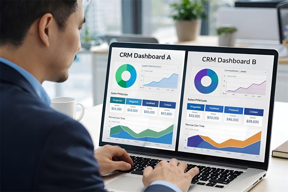
Moving client details out of spreadsheets and into HubSpot can feel like a large project. For an estate agency, the best starting point is a simple record of who has enquired, what they need and what happens next. You can build a useful real estate CRM around that before attempting more advanced features.
Start with contacts and deals
New users often mix up contacts and deals. Contacts are people and deals are transactions.
A contact record holds the person’s details, including their name and phone number. Log calls and notes there to build an activity history. That record stays in place while the same person enquires about different homes over time.
A deal follows a specific opportunity towards its outcome. It could track a buyer’s purchase journey or a seller instruction from valuation to completion. The deal moves through stages while the contact record remains the same.
Link the two every time. When a buyer enquires about a flat, their details belong on the contact and their progress belongs on the deal.
Keep it simple at first.
Don’t create separate pipelines for every possible scenario. One clear setup your team actually uses is better than four clever ones they don’t.
Pick one process to map first
Choose one journey to map before trying to cover both sales and lettings. A sales team could start with the buyer journey, while a lettings team might choose tenant enquiries. The example below uses buyers; adapt it to the work your team handles most often.
Build one pipeline for that journey. Keep the stages short and plain:
- New enquiry
- Qualified
- Viewing arranged
- Offer submitted
- Under offer
- Completion
Then define what each stage means. For example, Qualified could mean you have discussed budget and timeline, while Viewing arranged means a date and time are confirmed. Agree an exit rule for moving between stages: a deal might leave Viewing arranged once the viewing has happened and feedback is recorded. Use your agency’s agreed process for recording an accepted offer, and keep acceptance distinct from exchange and completion.
Delete stages you won’t use. If your team doesn’t do formal qualification, drop it. If exchange and completion are tracked elsewhere, don’t pretend to track them in HubSpot. A short pipeline you trust is better than a long one full of stale deals.
Add a handful of useful fields
Default contact fields won’t cover everything you need for property work. A few custom properties will make searches and lists more relevant to your team.
Start with four or five at most:
- Price range
- Preferred areas
- Mortgage position
- Buyer timeline
- Seller timeline, if you work both sides
Use dropdowns where you can. Free text for areas soon becomes messy, with ten spellings for the same neighbourhood. A tidy dropdown keeps filters and views usable.
Store feedback from individual viewings as notes linked to the relevant deal, rather than overwriting one contact field after every visit. Check your plan’s custom-property allowance before adding fields, and expand only when a recurring need becomes clear.
If putting this first setup together still feels like a lot to take on, a HubSpot partner such as Incremental can help with onboarding and integration setup so you don’t get stuck on the DIY details.
Connect email and keep follow-up manual
HubSpot doesn’t log everything by itself. You choose what to connect, and you should check the logging settings inside HubSpot before relying on them for client work and weekly reviews.
Email and calendar are sensible starting points. Connect a supported inbox so you can send replies from the CRM. HubSpot’s Google and Outlook calendar integrations can log new meetings with existing contacts, but they do not import events created before connection and only sync the user’s primary calendar.
Test a sample viewing invitation and inspect the contact timeline. Check its association with the relevant deal rather than assuming every appointment appears in the right place. Review email logging settings too, especially exclusions for internal or private correspondence.
After a viewing, keep the habit simple. Open the mobile app before you drive off. Add two lines about the client’s reaction and a next task with a date. That routine matters more than any later upgrade.
Manual tasks will carry you at first. Every open deal should have an owner and one task. Without an owner, no one is responsible for chasing it; without a task, the deal drifts.
Automation can wait. It often depends on your subscription and on what else you have connected, so don’t build follow-up around it.
Make this part of your morning routine. Filter for your open deals and set the next step before you close each record. That might mean calling back after a viewing or confirming mortgage documents.
Keep a human owner on each deal. No automatic setting replaces an agent who knows the context.
Test with samples and review weekly
Before you invite the team, test with two or three sample records. Create a buyer and move them from New enquiry to Viewing arranged. Check that fields make sense and that views filter the right people. If something feels clumsy, fix it now while it’s easy to change.
Then review weekly. This doesn’t need to be formal. Pull up the pipeline each Monday and look at where deals are sticking. Are new enquiries getting a first response the same day?
HubSpot won’t replace all your property software. You’ll still need portals for listings and separate tools for contracts and client accounts. Use HubSpot as the relationship record alongside those systems.
Get the simple version live and keep notes tidy. Let the process earn trust. That’s how a general system starts to feel like part of your daily property work.

How Digital Asset Businesses Can Strengthen Compliance and Financial Reporting

How Employee Well-Being Supports Productivity and Long-Term Business Performance

A First-Timer’s Guide to Using HubSpot as a Real Estate CRM

Digital Transformation for Physical Spaces: A New Approach

Digital Readiness: Future-Proofing Your Business Operations

125 Inspirational Car Quotes and Captions to Celebrate Your New Car

188 Deep Hurt Quotes with Images

148 Romantic Love Quotes for Her from the Heart

164 Relationship Goals Quotes for New Couples Expecting a Long Lasting Relationship

185 Cute Boyfriend Quotes for the Guy You Love
-
 Quotes6 years ago
125 Inspirational Car Quotes and Captions to Celebrate Your New Car
-
Growth6 years ago
188 Deep Hurt Quotes with Images
-
Quotes6 years ago
148 Romantic Love Quotes for Her from the Heart
-
Quotes5 years ago
164 Relationship Goals Quotes for New Couples Expecting a Long Lasting Relationship
-
Quotes6 years ago
185 Cute Boyfriend Quotes for the Guy You Love
-
Quotes6 years ago
141 Best Heart Touching Quotes about Love, Life, and Friendship
-
Quotes5 years ago
134 Time Flies Quotes for the Unforgettable Moments
-
Quotes5 years ago
122 Inspirational Kite Quotes That’ll Make You Wanna Fly Right Now