Tech
What Is a Map Chart in a Nutshell?

In today’s competitive business landscape, data analysis is crucial for making informed decisions and gaining a competitive edge. One highly effective tool for visualizing and analyzing data is map charts. Map charts provide a visual representation of data on a geographical map, allowing businesses to gain valuable insights into regional trends and patterns.
Keep reading to learn more about how a map chart can benefit analysis.
Unveiling the Concept of a Map Chart

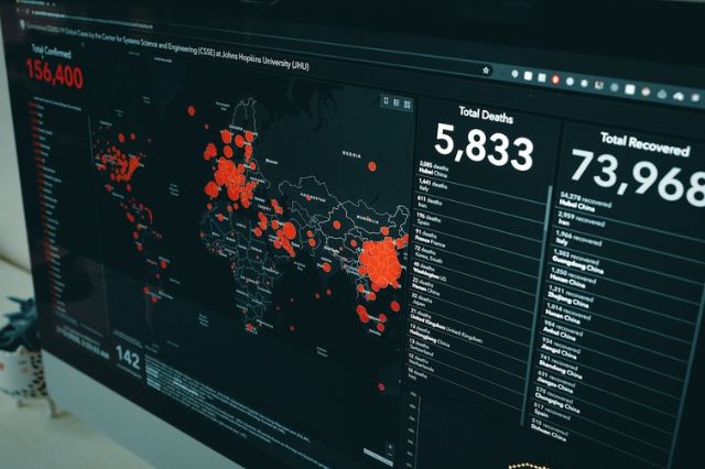
A map chart is a type of data visualization tool used to represent data related to geographic regions or locations. It displays data by shading or coloring different regions based on a specific variable or metric. The purpose of a map chart is to provide a visual representation of data patterns or distributions across different areas.
Map charts are helpful when analyzing data that varies across geographical boundaries, such as population density, income levels, election results, or environmental factors. The intensity of the data point or color in each region indicates the value or level of the variable being represented. Larger points or darker colors may indicate higher values, while smaller points or lighter colors may represent lower values.
These charts allow viewers to understand geographic patterns and identify trends or outliers. They make it easy to compare data across different regions and identify areas of interest or concern. Map charts are widely used in various industries, including economics, marketing, and research, as they provide a dynamic and visually appealing way to present complex data in a straightforward manner.
A map chart is immensely flexible and capable of showcasing everything from population densities and climate variances across regions to the success of your company’s marketing strategies in different zones. In essence, it is a power-packed instrument for in-depth data analysis.
Understanding the Significance of a Map Chart
The significance of a map chart is hard to overstate. Its prime function is to take a mass of big data, often overwhelming in volume and complexity, and present it in a manner that is graphical, intuitive, and instantly comprehensible.
A map chart empowers you to track trends, compare data sets, and identify outliers or anomalies at a glance. It enables you to condense volumes of complex data into visually accessible formats, thereby saving precious time and effort.
Additionally, a map chart is not just about improving comprehension. It also helps in engaging your audience. Whether you are delivering a presentation to your colleagues, clients, or even students, a map chart ramps up the interest level.
The task of making decisions based on data becomes far less daunting with a map chart. In business situations or research fields, where decisions are often based on patterns, trends, and forecasts, a map chart can play a pivotal role in deciphering hidden insights.
Analyzing the Role of Map Charts

The utility of map charts isn’t restricted to certain domains or professions. Be it in meteorology or marketing, urban planning, or sports, map charts have carved out a niche for themselves.
For instance, in disciplines such as geography and meteorology, map charts help visualize spatial data related to weather, climate, and population density. Businesses and marketers take advantage of map charts to evaluate sales performances, target new markets, and formulate marketing strategies.
In professions related to public health or urban planning, map charts aid in tracking disease spread or planning urban designs. Even in sports analysis, map charts come in handy to conduct detailed performance assessments.
Irrespective of the profession, a map chart offers a unique blend of simplicity and sophistication, providing a holistic way to analyze and interpret complex data.
Altogether, while there are challenges to map chart creation, the application and usefulness of the tool make it worth all efforts. From business analytics to scientific study, a map chart is a powerful data visualization tool for any profession requiring an analysis of large amounts of data.